What are Tertiary Colors? Definition and Meaning

Everyone has heard about primary and secondary colors, but what are tertiary colors?
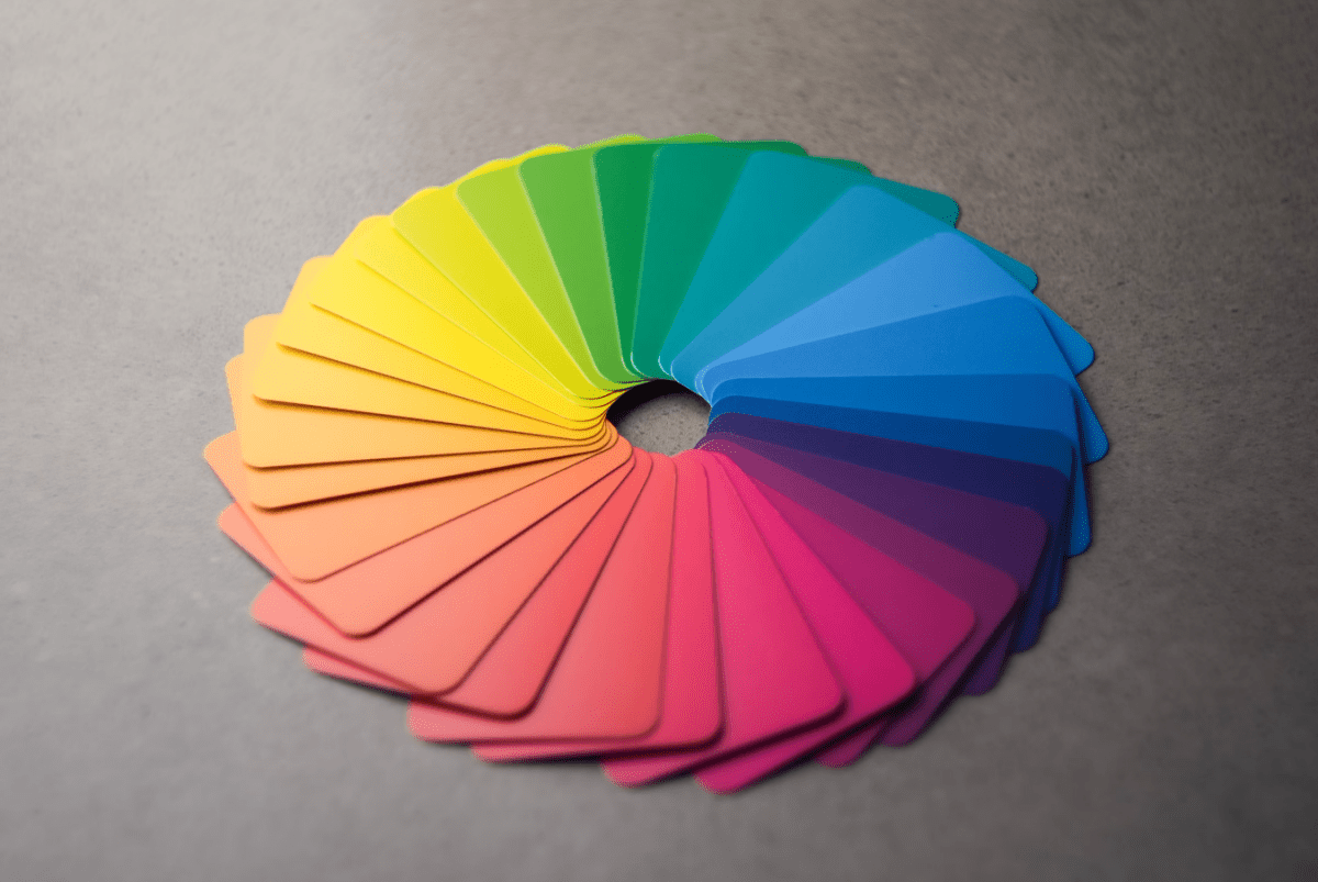
You’ve seen the color spectrum and color wheel, so you know that there are more than just primary and secondary colors. You also know this empirically. It’s a popular meme that women know so many hues of each color (especially related to make-up) compared to their male counterparts, and when you see two hues of violet next to one another, it’s clear that there’s a difference.
So, what are tertiary colors, how many are there, and how can you make/use them in your art?
What are tertiary colors?
Tertiary color is what you get when you mix a primary color with a secondary color.
Now, in order to understand this, there are two terms we need to define and clarify.
First of all, everyone knows what primary colors are:
- Red
- Blue
- Yellow
These are the basic colors that cannot be made by mixing other colors and they serve as a basis for creating all other colors.
By mixing them, you get secondary colors:
- Red and yellow create orange.
- Blue and yellow create green.
- Red and blue create violet.
Now, what happens when you add a bit more of a primary color to the secondary color? For instance, you mix red and blue to get violet, but then you add a bit more blue to the mix. Will the hue change? Of course, it will, and that’s exactly what a tertiary color is.
By adding more color, you’re adding more nuance to the mix, but you can’t make a tertiary color by just adding any primary color.
An example of a tertiary color would be blue-violet, but you have to add blue. Why? Because blue is adjacent to violet on the color wheel.
According to specialists from Number Artist, the most accurate definition of a tertiary color is what happens when you mix a primary color with a secondary color adjacent to it on the color wheel. This type of blending results in a more complex hue than a primary or secondary color alone would have on their own.
How many tertiary colors are there?

There are exactly six tertiary colors:
- Red-Orange
- Yellow-Orange
- Yellow-Green
- Blue-Green
- Blue-Violet
- Red-Violet
The biggest problem with tertiary colors is that they’re easy to underestimate. After all, to someone who’s not as familiar with tertiary colors in art, it’s really easy to assume that the difference between violet and blue-violet is really not that great.
In reality, tertiary colors drastically expand the color palette. Just think about monochromatic images, where you don’t actually see different colors, just hues and gradients of different colors. Some of the best pieces of art and some of the most popular paint-by-numbers images belong to this category. Needless to say, creating this without tertiary colors would be impossible. You just wouldn’t have enough nuances.
Tertiary colors are also important for creating color harmony. Just think about transitions and the color wheel. Blue-green is a color that you can use to make the transition between blue and green smoother. On the other end, you can use blue-violet as a bridge between blue and violet. This way, it will be much harder to see where one color stops and the other begins. This is the sort of tertiary art that is only made possible by these hues.
You can also use them for shading, seeing as how they add depth and dimension to artwork design. Gradients, highlights, and even making objects appear more three-dimensional are easier when you master the blend of tertiary colors. Speaking of which…
Tips for blending tertiary colors

Now that you understand tertiary colors let’s talk a bit about how you can use them for tertiary color art. In order to do so, you must first learn how to blend them, and there are a few tips you should follow.
You need to start by learning a color wheel in order to understand the relationships between colors better. The concept is simple: when you add more primary color, you’re moving the hue from the adjacent color back to its primary color. Not all the way, of course, but a move can be pretty significant depending on the quantity.
The most important piece of advice is that you need to mix colors gradually. You see, every time you add a primary color to a secondary, you’re getting a tertiary color, but the hue will depend on the amount that you’ve added.
The thing is that you can always add more, but you can’t really subtract. In theory, you could mix more violet to add, but it might not be the same hue of violet, and the entirety of the process is both complex and wasteful. After all, you have to use a lot more color to get the same effect, and you might not even waste it because you don’t want to make the layers too thick.
If you’re engaging with tertiary color drawing, you want to be precise and careful. You also want to use as little color as you can get away with.
Keep in mind that you can always add neutral tones like white, grey, or black in order to make it lighter or darker.
Most importantly, you want to clean brushes before mixing more color. This way, you’re more accurate.
Tips for painting with tertiary colors
Understanding what tertiary colors are is just the beginning, you also need to develop a much deeper understanding of how to use them in practice.
Their main role is to add subtle variations to your images. These are the so-called shadows, highlights, and mid-tones. Just find an object in your image that’s blue or violet, and you’ll probably realize that you can use blue-violet on one of the sides or in an area where the light falls on the object just right.
Interestingly enough, custom paint-by-number kits are a great way to understand the importance of using tertiary colors. As a layman, you might struggle to apply it to your own painting, but when you know where it goes, suddenly, the idea and the concept become a lot clearer.
Another technique you should try is layering colors for depth. The way this works is pretty simple: you start with a base layer and then add layers of transparent and semi-transparent tertiary color in order to create depth and richness. While this method can be used in any painting technique, with watercolor and acrylic painting, it tends to be the richest and the most effective. This is tertiary color art at its peak.
Most importantly, you need to understand that tertiary colors seldom stand on their own. You need to learn how to balance them with primary and secondary colors. Here, you’ll have to trust your intuition, but we don’t doubt for a second that you’ll soon develop a sense of it.
Tertiary colors are more than just nuances of secondary colors
A lot of people would try to answer the question of what tertiary colors are by saying that they’re just secondary colors with a nuance that leans more in one way or another. However, this is really not the most accurate. Tertiary colors are their own thing, and without them, art as we know it wouldn’t be possible. They’re the next stage in color mixing, and you cannot become good at this skill without mastering tertiary colors.


