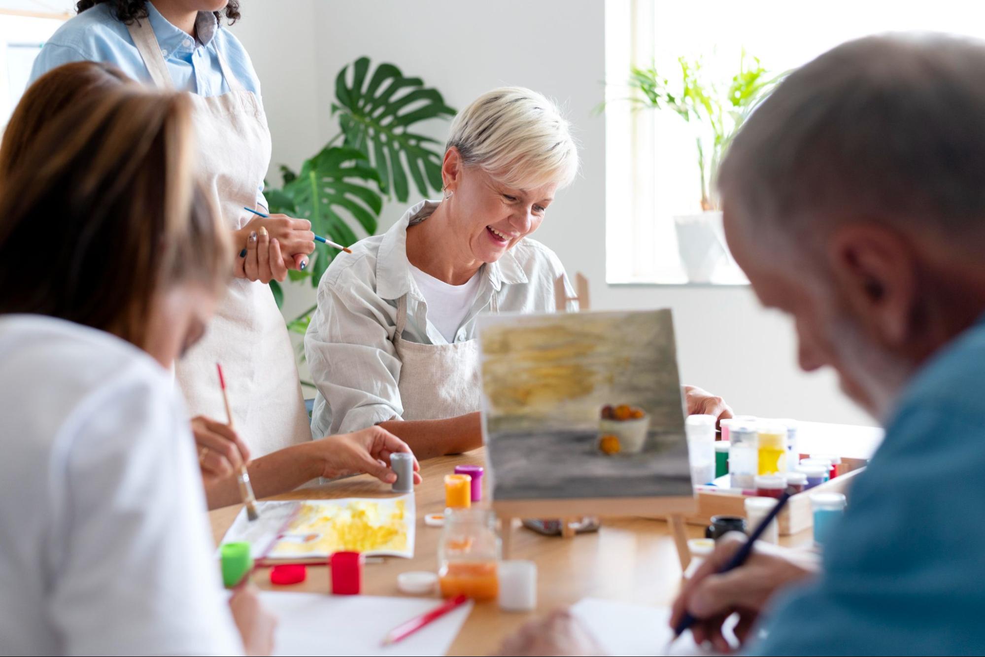

Artículo: Easy Acrylic Painting Ideas: Techniques and Creative Tips
Easy Acrylic Painting Ideas: Techniques and Creative Tips

If you’ve just gotten into painting, chances are you’re looking for some acrylic painting ideas for your first project. On top of this, you might need additional tips, such as which techniques to use, how to combine different colors, and which beginner mistakes you should try to avoid.
The good news is that acrylics are one of the easiest mediums to learn, giving you plenty of freedom to experiment while building confidence with every painting. With that said, we created this guide that puts together everything you need to know before working with acrylics for the first time. In it, you’ll find everything from simple projects for beginners to helpful tips to build your confidence.
Why Acrylic Paint Is a Great Place to Start
Acrylics sit in a sweet spot for beginners. They're more forgiving than watercolor, which is another good option for new artists but can be unpredictable with how it spreads and blends. They're also far less fussy than oils, which require solvents, longer drying times, and a bit more patience than most newcomers have on day one.
With acrylics, you can paint over a section you don't like once it dries, which usually takes somewhere between fifteen minutes and an hour depending on thickness. You can thin them with water to mimic watercolor effects, or use them thick and textured straight from the tube.
Another important thing to mention is that starting a new hobby always requires some money. Buying acrylic paints and other supplies doesn’t have to be expensive, especially if you do some research online and decide on a set that you’ll use for your first project.
Easy Acrylic Painting Ideas to Try
This is probably the part you’ve been waiting for the most. We came up with several painting concepts that are approachable, satisfying to complete, and don't necessarily require advanced skill.
Abstract Color Block Grid

Abstract art is one of the easiest places to begin because it lets you focus on color, shape, and texture instead of painting a recognizable subject. A grid of loose, uneven color blocks is less about representing anything and more about practicing how colors sit next to each other. Divide your canvas into a rough grid, then fill each section with a different color or shade, letting the edges stay a little imperfect. There's no wrong way for a hand-drawn grid to look.
Use painter's tape if you want cleaner lines between sections, or paint freehand for a looser, more organic feel. Try grouping colors that share an undertone in some blocks and pairing high-contrast colors in others, so the piece has both calm areas and points of tension. A palette knife works well for filling in larger sections quickly, leaving behind subtle texture that a brush would smooth away.
Drips and Pours
 A piece built entirely from paint drips and pours leans into what acrylic does naturally rather than fighting it. Thin your paint slightly, tilt the canvas, and let gravity do a lot of the composing for you. It's an easy way to end up with something that feels loose and expressive without needing any drawing skill at all.
Work on a canvas propped at an angle, and pour or drip one color at a time, letting each one run before adding the next so they don't blend into mud. Contrasting colors, like a warm and a cool tone, keep the drips visually distinct as they travel down the canvas. A hairdryer on a low setting can slow or redirect a drip if you want more control over where it ends up.
Calm Lake at Dusk

A still lake reflecting a soft, colorful sky is a scene where imprecision reads as atmosphere. A slightly wobbly reflection, a color that bleeds a little further than you meant it to, and a horizon line that is not perfectly straight. None of these things look like a mistake, because that's how water really behaves.
Block in the sky first with a gentle gradient, blending two or three warm colors while the paint is still wet. Once dry, paint a slightly darker, softer version of the same colors below the waterline for the reflection, dragging your brush horizontally so the strokes read as water rather than sky. A thin, uneven line where sky meets water, and a few short horizontal streaks of a lighter tone across the reflection, are enough to sell the calm surface.
Starry Night Sky

A wide, dark sky scattered with stars over a simple horizon line is one of the most approachable scenes to paint, because the background does most of the visual work before you've even added the details. A deep blue or near-black canvas already looks finished on its own, so every star or cloud you add afterward feels like a bonus rather than a necessity.
Start with a dark blue base for the sky, blending in touches of purple or black so it doesn't read as one flat color. While still wet, dab in a few soft clouds with a lightly loaded brush in gray-blue, keeping the edges loose. Once dry, flick a small brush loaded with white paint across the canvas to scatter stars, varying the size and spacing. Add a tree line or distant hills along the bottom to ground the piece.
Layered Hills or Mountains

A row of hills or mountains stacked one behind the other is an easy way to practice depth without drawing anything complicated. Each shape is just a rounded or jagged silhouette, and the illusion of distance comes from color and value rather than detail. Lighter, cooler tones sit farthest back. Darker, warmer tones sit up front. There's nothing to get wrong in terms of form, which makes it a good subject when you want to focus on paint handling instead of drawing accuracy.
Paint from back to front, letting each shape dry before adding the next so the edges stay crisp instead of muddying together. A flat brush or the edge of a palette knife gives you clean, confident lines for each ridge. Mixing a single base color with small amounts of white and blue as you move forward is enough to build the whole sense of distance. No need for a big color set.
Sunlit Meadow with a Single Tree

One tree standing alone in an open meadow, with soft sunlight coming from one side, is a classic, easy scene because the whole composition rests on just two shapes: the tree and the ground it stands on. The open space around it does the rest of the work.
Paint the sky and meadow as two broad sections first, keeping the meadow slightly warmer where the sunlight would hit it. Once dry, build the tree from a simple trunk shape and a rounded canopy, using a dabbing motion with a round or fan brush to suggest leaves without painting them individually. A long, soft shadow stretching out from the base of the tree, painted in a muted, cool tone, anchors it to the ground and adds a sense of light direction.
Snow-Covered Pine Trees

A cluster of pine trees dusted with snow, set against a pale winter sky, is a quietly satisfying subject built almost entirely from repeated triangle shapes. The snow does a lot of the work here, softening what would otherwise be sharp, uniform trees into something with more texture and variation.
Paint the trees first as simple dark green triangles, varying their height so the cluster feels natural rather than evenly spaced. Once dry, load a dry brush lightly with white and dab it along the branches to suggest clumps of snow, pressing harder in some spots and lighter in others. A few soft white dots scattered across the sky, added last with the tip of a small brush, finish the scene as falling snow.
Simple Teacup or Mug

A single teacup or mug on a plain surface is a classic starting subject because the shape is simple geometry: an oval for the top, a curve for the body, a loop for the handle. Once that's right, the rest is just shading. Add a spoon or a folded napkin beside it if you want a little more to work with, but the cup alone is enough to carry a full piece.
Block in the basic shapes first with a mid-tone before worrying about light or shadow, so the proportions are settled early. Once that's dry, build shadow on one side with a slightly darker mix, and save your lightest color for last. A small, precise highlight along the rim or handle, added with a fine brush right at the end, is what makes the object look like it's actually sitting on the table.
Halved Citrus Fruit

A halved citrus fruit sitting on a plain table gives you strong shape, bright color, and built-in shading all in one small subject. Cut a lemon or orange in half, place it on a white or pale surface, and you've got a painting with almost no setup work. The inside pattern does most of the visual work for you, so you don't need to invent an interesting scene: the fruit already is one.
Blend the segments inside the fruit while the paint is still wet, so the colors merge into each other instead of sitting in hard bands. Once that layer dries, switch to a dry brush for the rind, dragging a nearly bare brush over the surface to suggest texture without painting every dot and pore. Two or three colors (one citrus tone, one shadow tone, and one background tone) are enough to carry the whole piece.
Small Potted Cactus

A small potted cactus is forgiving in almost every way. The shape is simple, the color range is narrow, and mistakes tend to read as texture rather than errors. One round or column-shaped cactus in a plain pot gives you a complete subject without any background decisions to agonize over. It's a good choice when you want something that looks intentional even on a first try.
Block in the base green first, then use a dry brush loaded with a lighter green or yellow to flick in the ridges and spines. This is where the texture comes from, not from painting each spine individually. Shadow along one side of the pot and cactus grounds the whole thing and gives it weight. A thin, almost-dry line of dark green or brown along the ridge shadows adds the final bit of dimension.
Techniques Worth Practicing
Beyond just picking a subject, learning a handful of painting techniques will make every future painting easier and more controlled.
Dry Brushing
This involves using a brush with very little paint on it, dragging it across the canvas to create a textured, scratchy effect. It's especially useful for grass, fur, wood grain, or clouds. Dip the brush lightly, wipe off most of the excess on a paper towel, then drag it across the surface.
Wet-on-Wet Blending
Applying a new color into paint that's still wet allows the two to blend softly into each other. This works well for skies, water, and skin tones. The key is working quickly before the acrylic starts to dry, since it sets faster than oil paint.
Layering and Glazing
Once a layer is fully dry, you can paint a thin, transparent layer of a different color over it to shift the tone or add depth. This is called glazing, and it's done by mixing paint with a glazing medium or just a bit more water than usual. It's a subtle technique but adds a professional touch once you get the hang of it.
Stippling
Using the tip of the brush to dab paint onto the canvas in small dots creates texture that's great for foliage, flowers, or stars. It's a slow technique but very low pressure since there's no long brushstroke to mess up.
Sgraffito
This fancy-sounding word just means scratching into wet paint to reveal the layer underneath. You can use the end of a paintbrush, a toothpick, or even a fork. It's a fun way to add fine detail like grass blades, hair strands, or texture in tree bark.
Color Mixing Basics
A lot of beginner frustration comes down to color mixing rather than brush skill. Understanding a few basics goes a long way.
Start with a limited palette: red, yellow, blue, white, and black. From these five, you can mix an enormous range of colors. Adding white lightens a color and is called creating a tint. Adding black darkens it, which is called a shade, though many painters prefer using a complementary color instead of black since pure black can sometimes flatten a color and make it look muddy.
Mixing two primary colors creates a secondary color. Red and yellow make orange. Blue and yellow make green. Red and blue make purple. From there, mixing a primary with a secondary, or two secondaries together, creates the wider range of tertiary colors that fill out most realistic paintings.
Don't be afraid to mix more paint than you think you'll need. Running out mid-painting and trying to match the exact same shade again is one of the more annoying problems a beginner can run into.
Common Mistakes to Avoid
Although everyone’s first painting experience is different, there are some common patterns that show up again and again with beginners. Knowing what they are is the first step to making sure you don’t make these mistakes.
Let’s start with the one that haunts many first-time painters — using too much water. This can break down the acrylic's binding properties and make the paint chalky once dry. A little water for blending is fine, but treat it more like a small addition than the main liquid in your mix.
Squeezing too much paint onto the palette is one of the more common early habits, especially when a tube feels like it should be worth using generously. Acrylic paint goes much further than beginners usually expect, and any paint left sitting on the palette will dry within the hour and end up in the trash. Start with a small dab of each color, roughly the size of a pea, and add more only when you actually run out.
Working on cheap, thin paper or canvas can cause warping or paint that doesn't sit well on the surface. A reasonably good quality canvas, even a budget one from a craft store, will hold paint better than printer paper or a thin sketchbook page.
Rushing through layers before they're dry tends to create muddy colors when they blend unintentionally. Acrylic dries fast, but it still needs a few minutes between layers if you want clean separation.
Cleaning brushes too late, or not at all, ruins them faster than almost anything else. Acrylic that dries inside the bristles is extremely difficult to remove, so rinsing as you go is worth the small interruption to your painting flow.
Bringing It All Together
The best way to actually improve at acrylic painting is to keep starting new pieces without overthinking each one. When you come up with a good idea, quickly set up your space, and give yourself permission to make something imperfect. Even if your first painting doesn’t end up looking the way you imagined, the process itself was a lesson about color, brush control, or composition that carries into the next one. More often than not, your first painting will still be good enough to hang it proudly on a wall.
Acrylic painting rewards patience more than talent. The people who get good at it aren't necessarily the ones with the steadiest hands from day one, they're the ones who keep showing up to the canvas until the results start looking better and better.
Frequently Asked Questions (FAQs)
1. How long does acrylic paint take to dry?
Thin layers usually feel dry to the touch within 15 to 30 minutes, though thicker applications can take an hour or longer. Full curing takes much longer, sometimes weeks for heavy layers. If you're adding a detail on top of a fresh coat, wait until the surface no longer feels cool or tacky, or the colors underneath will lift and blend into your new stroke.
2. Do I need special paper or canvas for acrylics?
A basic stretched canvas or canvas board works well for most beginner projects, and you can find either affordably at any craft store. Acrylic paper is another good option if you want to practice without committing to a canvas. Regular sketchbook or printer paper isn't ideal because it tends to warp when the paint dries.
3. What size canvas should I start with?
An 8×10 or 9×12 inch canvas is a comfortable starting size. It's small enough that filling it doesn't feel overwhelming, but large enough to give you room to work on shapes and details without cramping. Once you've finished a few pieces at that size, you'll have a better sense of what feels right for the next one.
4. How many colors do I actually need to start?
Five is enough: red, yellow, blue, white, and black. From those five, you can mix almost any color you'll need for a beginner project. As you paint more, you'll find yourself wanting a few specific colors on hand — a good green, a warm brown, a soft gray — but there's no reason to buy a 24-tube set on day one.
5. What's the difference between student-grade and artist-grade acrylics?
Student-grade paints are cheaper and use less pigment, which means the colors are slightly less vibrant and can look a little dull once dry. Artist-grade paints are more concentrated, so a small amount goes further and the colors stay vivid. For beginners, student-grade is completely fine — you'll get more mileage out of buying a student set and painting often than a premium set and painting rarely.
6. Can I mix acrylics with other mediums?
Yes, within reason. Acrylics work well with a wide range of acrylic-specific mediums that change how the paint behaves — glazing medium for transparency, retarder to slow drying, gel medium for texture. Mixing acrylics with oil paint doesn't work because oil and water don't bind properly, but layering acrylic under oil (never on top) is a common technique in more advanced work.
7. How do I keep my brushes from drying out mid-painting?
Keep a jar of water within reach and rinse your brush between colors, not just at the end of the session. If you need to step away for more than a few minutes, leave the brush lying flat with the bristles slightly wet, or resting in water with the bristles submerged but not bent against the bottom of the jar. Acrylic that dries inside the bristles is nearly impossible to remove.
8. Should I use a palette or something else?
A palette makes mixing easier, but you don't need a real one to start. A paper plate, a piece of parchment paper, or even a ceramic dinner plate you don't mind cleaning works fine. What matters is having a flat surface where you can mix small amounts of paint and see the colors clearly. Stay-wet palettes are worth trying eventually because they keep acrylics workable for hours instead of minutes.