What Are Analogous Colors in Art?

Everyone knows what basic colors are. Everyone knows what secondary colors are. Some people even understand the concept of tertiary colors, but what are analogous colors in art? How do they work, why do they matter, and what is their application? Here’s what you need to know on this subject.
What does analogous mean in art?
The answer to this question is unusually complex. First of all, analogous means adjacent, so when you look at the color spectrum or a color wheel, the color next to the current color would be adjacent.
To do this, you would have to understand the three stages of colors:
- First, you have basic colors, which are yellow, blue, and red. These are colors that you cannot get by mixing other colors.
- Next, you have secondary colors, which are the ones you get by mixing primary/basic colors. These are orange (you get by mixing yellow and red), violet (you get by mixing red and blue), and green (you get by mixing yellow and blue).
- Lastly, you have tertiary colors, which you get by adding more primary colors to the adjacent secondary colors. There are six such colors. You have blue-violet, red-orange, yellow-orange, yellow-green, blue-green, and red-violet.
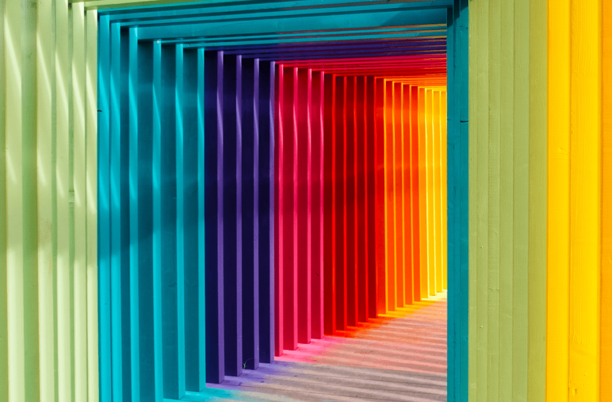
Analogous colors are the ones that sit between each other on the color wheel and create a clean transition between three similar colors. This is usually a trio, a set between one primary, adjacent tertiary, and subsequent secondary color (always in this order because that’s how they sit on the wheel).
What does analogous mean in art?

The question of what analogous means in art is really not as abstract or ridiculous as it may seem. At first, the structure of the sentence may seem like asking what kind of clothes should you wear without giving any context to the location, occasion, or the weather, but there’s a method to this madness.
You see, analogous colors usually act as nuances in showing a theme. They can be used to create a monochrome setting but one that has a clear symbolism. Here are four examples of analogous colors used to represent a theme symbolically. Hopefully, it will help explain what is analogous in art and how it can be used.
- Yellow, Yellow-Green, Green: These colors sit next to each other on the color wheel and create a fresh, natural look often associated with nature and growth.
- Red, Red-Orange, Orange: This combination is warm and energetic, often used to evoke feelings of warmth, passion, and excitement.
- Blue, Blue-Green, Green: This set of analogous colors creates a calming, serene effect, often used in designs to evoke tranquility and peace.
- Violet, Red-Violet, Red: This combination is rich and dramatic, often used to create a sense of luxury and depth.
In other words, colors express emotions; like in emotions, there’s always nuance.
When using custom paint-by-number kits for adults, you don’t have to worry about transitions or the exact hues used in a single setting. When painting anonymously, however, understanding the color wheel and analogous colors makes a world of difference.
Important for teaching art
One of the most important things you need to understand about analogous colors is their importance for teaching kids art. Teaching them what are analogous colors is about more than just teaching them to recognize hues and nuances.
It’s also the best way to teach your kids how to blend colors.
You can teach them that if you add blue to yellow, you get green, but if you add more blue to green, you get a significantly different hue.
You also teach them to match colors. Sure, any two colors can do, and even completely opposite colors can create a strong contrast; however, when trying to create a theme, you’ll have to use analogous colors.
Some of these numbered painting kits are actually monochrome, which means that the use of analogous colors is always mandatory. Now, we know what you’re thinking: how can monochrome involve two colors (since analogous, by default, involves a primary and a secondary color, which is interpreted as two colors)?
Well, this is why analogous color art relies so heavily on the use of tertiary colors. Being similar enough to each color makes them look even more similar than they are. For instance, red-orange is so similar to both red and orange that by acting as a barrier (gradient), it actually makes the red and orange look more alike than they would without it.
According to specialists behind Number Artist, while master artists know this feeling, analogous colors are a useful tool for novices to start developing a sense for it.
Famous pieces displaying analogous colors

There are so many analogous paintings by famous artists, and here are a few examples:
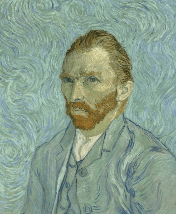
- “The Starry Night" by Vincent van Gogh (1889): Van Gogh’s iconic masterpiece uses a swirling mix of blues and yellows, creating a dreamy, night-time atmosphere. The analogous colors of blue, blue-green, and touches of yellow-green blend seamlessly, giving the sky a fluid, cohesive look that’s both calming and dynamic.
- "Water Lilies" by Claude Monet (1916): Monet’s "Water Lilies" series beautifully showcases the harmony of blue, blue-green, and green tones. These analogous colors mirror the natural world, immersing the viewer in a tranquil, almost meditative environment, where the water and foliage flow together effortlessly.
- "Sunflowers" by Vincent van Gogh (1888): In his "Sunflowers" series, Van Gogh employs a warm palette of yellows, yellow-oranges, and orange-reds. These analogous colors work together to create a vibrant, sunny scene that radiates warmth and energy, making the flowers appear almost as if they’re glowing.
- "The Scream" by Edvard Munch (1893): Munch’s "The Scream" utilizes a dramatic blend of orange, red-orange, and red tones in the sky, enhancing the sense of urgency and emotional intensity. The analogous colors amplify the swirling, turbulent atmosphere, reflecting the inner turmoil of the figure at the center.
- "Irises" by Vincent van Gogh (1889): Van Gogh’s "Irises" is a wonderful example of how blues, blue violets, and violets can be used together. The analogous colors create a serene and unified composition, where the flowers and background complement each other, drawing the viewer into a peaceful yet vibrant garden scene.
Through these pieces, you also have a chance to see the variety of instances of an analogous meaning in art. You have probably seen these pieces so many times already, and now might be the time to revisit them.
Understanding analogous colors will add much more nuance to your painting and your understanding of art
So, what are analogous colors in art? They’re the missing ingredient to give the color palette much more context. If colors are words, then analogous colors are the semantics. This is a concept that you should never forsake or underestimate. Sure, explaining the concept is simple: it’s a gradient consisting of three adjacent colors on the color wheel (primary, secondary, and tertiary). In practice, however, they’re so much more.