Artículo: Color Psychology in Art: What Your Palette Says About Your Mood
Color Psychology in Art: What Your Palette Says About Your Mood

Pick up any painting and your gut reacts before your brain does. Something about the colors pulls you in, unsettles you, or wraps you in warmth before you've consciously registered a single symbol. That instinctive reaction traces back directly to the psychology of color, and artists have been exploiting it for centuries.
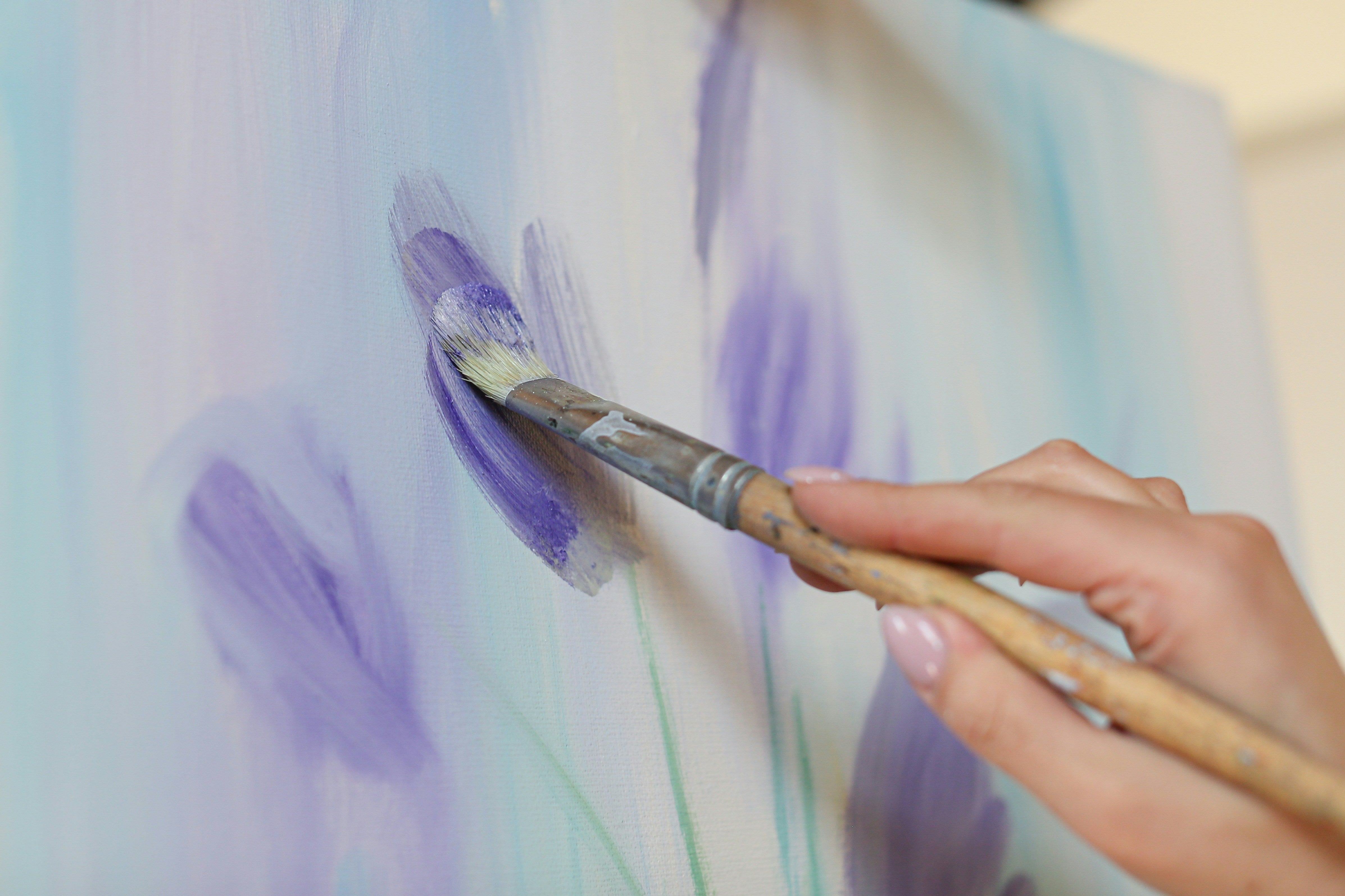
Long before researchers started measuring cortisol levels and pupil dilation, painters made deliberate palette choices to steer viewers' feelings. A warm red pressures you. A cool blue opens up the room. These choices are rooted in how human perception actually works, and the more you understand that, the more intentional your art becomes.
The Number Artist team is here to walk you through the major colors one by one, unpacking what's common knowledge, what's less obvious, and what the science actually confirms about color psychology in art.
The Science and Theory Behind Color Psychology
Color psychology sits at a crossroads among neuroscience, cultural history, and perception research, and it rewards anyone willing to look beyond surface associations. Your brain doesn't process color in isolation but in context, filtered through memory, culture, and even language.
The core mechanism is well-established. The eye's photoreceptors detect wavelengths of light, send signals to the visual cortex, and, from there, the limbic system is engaged almost immediately. Color perception and emotional response are both neurologically and metaphorically linked.
And once culture enters the picture, science grows even more complicated! Wearing white signals mourning in several East Asian traditions and purity in Western ones. Red means luck in China and danger across much of the West. So the psychology of color is never a universal fixed code. It's a system of tendencies, defaults, and cultural overlays all working at once.
What this means for artists is significant. When you choose a palette, you're making a psychological decision (consciously or not). Researchers like Rudolf Arnheim and Josef Albers spent careers documenting how color relationships shape perception. A red next to orange reads very differently from a red next to black, because the surrounding context shifts the emotional signal entirely.
This is also why paintings with deep meaning rarely rely on a single color to carry the weight. The emotional impact almost always comes from tension or harmony between colors working together, which brings us to the individual hues themselves.
Red – The Color That Commands the Room

Red is one of the oldest used pigments in human history, found on cave walls dating back over 40,000 years. Our relationship with it runs deep, and the red color's meaning has stayed remarkably consistent across time. It signals blood, fire, urgency, and desire, sometimes all at once. No other color carries that kind of simultaneous weight.
Red is one of the most-researched colors (partly because it appears in art as early as cave paintings). Recent studies show that exposure to red increases heart rate and raises alertness, which is why it appears on stop signs, fire trucks, and sale tags worldwide. Countless painters have used this to their advantage for just as long. Delacroix loaded his canvases with red to inject tension – in “The Death of Sardanapalus,” his red simultaneously symbolizes luxury and decadence as well as blood and wounds. Mark Rothko used red to create an almost physical pressure that viewers describe as suffocating or transcendent, depending on the day.
What's less commonly discussed is how red shifts depending on its saturation and surroundings. A deep crimson reads as luxury and gravity. A bright scarlet reads as an alarm. Artists who understand this choose their red carefully, because that choice shapes everything about how the work lands emotionally.
Moreover, red carries strong cultural baggage that artists can either lean into or subvert. In Western traditions, it is associated with danger and passion. In Chinese art and culture, it is connected to luck and celebration. A painter working with red is always in conversation with that history.
Blue – Calm on the Surface, Complex Underneath

Blue is the world's most commonly cited favorite color, and that popularity tells you something useful. It's broadly non-threatening, associated with open skies and still water, and it tends to lower heart rate rather than raise it. However, reducing blue to simply "calming" overlooks much of what makes it so interesting to work with.
Research on the psychology of blue color reveals a genuine duality. On one side, you have the blue of clear days and clean water, expansive, peaceful, trustworthy. On the other hand, you have the blue of cold, distance, and melancholy. The English language even encodes this: feeling blue, singing the blues. Artists have always played both sides of that register.
Picasso's Blue Period is the obvious example, but it holds up for good reason. By limiting his palette to blues and blue-greens, he built an entire emotional world that viewers enter and feel physically. The color did the atmospheric work, so the figures didn't have to carry it alone.
Also worth noting is how blue behaves in relation to neighboring hues. Its emotional tone shifts considerably depending on what sits beside it, which an understanding of analogous colors in art helps clarify. A blue pulled toward green reads very differently from a blue pulled toward violet, and painters who treat them as interchangeable tend to produce muddier emotional results than they intended.
Yellow – Optimism With a Sharp Edge

Yellow is the color the brain registers fastest, and artists have long understood what that means in practice. It draws the eye before anything else on the canvas has a chance, which makes it both a powerful and a risky tool. Used well, yellow energizes a composition. Pushed too far, it overwhelms everything around it.
The common association is cheerfulness, and that holds up to a point. Studies on color and mood consistently place yellow on the positive end of the emotional spectrum. However, the same research shows that prolonged exposure to intense yellow increases anxiety and agitation. Nurseries painted bright yellow tend to produce more crying infants. Casinos use it strategically to keep people stimulated and slightly on edge.
In art history, yellow carries some of its most interesting baggage through Van Gogh, who used it with an intensity bordering on obsession. His yellows in Sunflowers and The Bedroom read as joyful on the surface, but art historians have long noted an undercurrent of unease in how he applied them. The color pushes forward so aggressively that it creates visual tension rather than comfort.
The green color meaning also comes into focus when placed next to yellow, since the two share a warm-to-cool boundary that painters use to control temperature across a composition. That relationship between neighboring hues is worth paying attention to, because yellow rarely works in isolation.
Green – Growth, Envy, and Everything In Between

Green occupies a strange position in color psychology. Research on green color psychology consistently links it to nature, restoration, and calm. Hospitals use it in waiting rooms. Studies show that time spent in green environments lowers cortisol. On the other hand, green has one of the most sinister symbolic histories of any color in Western art.
The envy association goes back centuries. Shakespeare gave us "the green-eyed monster" in Othello, but the connection predates him. Medieval European painters used sickly greens to depict illness, jealousy, and moral corruption. Grünewald's altarpiece figures show flesh turning green at the extremities as a signal of decay. The color carried a dual meaning that artists exploited deliberately.
What makes green particularly interesting to work with is its sensitivity to mixture. A green leaning toward yellow reads as fresh and alive. A green leaning toward blue reads as cool and slightly remote. Push it further toward gray, and it starts to feel institutional. The use of tertiary colors matters so much when working with green because small shifts in its composition produce dramatically different emotional readings.
Moreover, the psychology of green color shifts considerably across cultures. In Islamic art, green carries sacred significance and appears prominently in religious contexts. In Celtic traditions, it connects to the otherworld and supernatural forces. A painter reaching for green is working with a color that carries more contradictions than almost any other on the wheel.
White – The Color That Isn't Quite Neutral

Most people treat white as an absence, a blank slate, the color you start with before the real work begins. This is not true in physics, since white is not the absence of color – it’s the presence of all colors at the same time. In art, white is one of the most psychologically loaded colors an artist can use, precisely because viewers bring so many assumptions to it. Things that are white carry an expectation of purity, cleanliness, and simplicity, and artists who understand this can either confirm that expectation or use it against the viewer entirely.
In Western art and culture, white connects strongly to purity, innocence, and the sacred. Wedding dresses, baptismal robes, marble temples. However, that same association flips in other cultural contexts. So when an artist uses white prominently, the reading depends heavily on what the viewer brings to the work.
What's scientifically interesting about white is how it behaves perceptually. White advances toward the viewer in a composition, much like warm colors do, which makes it an active presence rather than a passive background. Painters like Kazimir Malevich understood this. His White on White series wasn't an exercise in minimalism for its own sake. He was testing how far white could carry meaning when stripped of every other visual cue.
Also, white in conceptual and installation art has been used to signal everything from transcendence to clinical coldness to erasure. The context does the interpretive work, but the color creates the conditions for that interpretation. White is never just white.
Wrap Up
Every palette choice an artist makes carries psychological weight. The red color meaning that made cave painters reach for ochre is the same force that makes a Rothko canvas feel like pressure on the chest. Green color psychology is connected to sacred growth in one tradition and to envy and decay in another. Blue opens space. Yellow agitates. White carries entire cultural histories in a single field of paint.
Understanding the psychology of color doesn't reduce art to a formula. The most interesting artists have always used these associations as a starting point, then deliberately pushed against them. That tension between expectation and subversion is where a lot of the most compelling work lives.
The next time you stand in front of a painting and feel something you can't immediately explain, look at the palette. Sometimes, you’ll be able to feel the answer even if you fail to understand it.
Frequently Asked Questions (FAQ):
1. What is color psychology in art?
Color psychology in art examines how colors shape our feelings when we look at a painting or other visual work. Artists have used this knowledge for centuries, often intuitively. Every palette choice carries an emotional signal, whether the artist planned it or not. The field draws on neuroscience, cultural history, and perception research to explain why certain colors hit the way they do.
2. Why does red feel so intense in paintings?
Red actually raises your heart rate and sharpens your alertness, which is why it can read as urgent, passionate, or even threatening depending on the context. Painters like Delacroix and Rothko knew this and used red to create real tension in their work. Also, the specific shade makes a bigger difference than most people realize. Deep crimson and bright scarlet are technically in the same color family, but they appear very different.
3. What does green symbolize in art?
Green color psychology pulls in two directions at once. On one side, you have nature, calm, and renewal. On the other, Western art has a long history of using green to signal envy, illness, and decay. Medieval painters reached for sickly greens when they wanted to show moral corruption. Islamic art, however, treated green as sacred. The shade and context do a lot of the interpretive work.
4. Is white really a neutral color in art?
Not even close. Things that are white carry enormous cultural baggage. In Western traditions, white is connected to purity and innocence. In several East Asian cultures, it's the color of mourning. Beyond symbolism, white behaves actively in a composition, advancing toward the viewer rather than receding. Malevich built an entire series around white as a subject in itself, which tells you everything about how much weight it can carry.
5. Does color psychology apply universally across cultures?
Some of it does, some of it doesn't. Certain physiological responses to color seem to show up consistently across different populations. However, the symbolic layer varies a lot. Red means luck in China and reads as danger across much of the West. White flips meaning entirely depending on where you are. The psychology of color works best when you treat it as a set of strong tendencies rather than universal rules.